tested also yesterday with wineskin (and opengl flag) and also had the icons in the top bar crumped together with 1920x1080 resolution. Does this also counts as low resolution?
Regarding the Grey colors: i like them. they are good readabke on my monitor and Im not sure if these are more hard to read for some people or if their monitor is maybe not calibrated right. Or do we deal here with sime kind of color blind/weak nesses?
Yes, actually grey colors on white backgrounds are better readable than black ones - that's what we've learned back in graphic design school. I do also believe that Machtnix has a weak (maybe old) screen or it is a problem with the device driver.
The icons are together too ( I wrote) - side by side without space. I use 1280 x 1024. It's not very fine to handle.
My monitors aren't that old and calibrated for printing, that means DARK (not 100% contrast, not 100 brightness), but there are the last two best 4:3-ones. So I wonder if the grey is too light for me. Other users love this 100/100%-standard values and that is too much contrast for me and the grey is even more too light.
I can't see very sharp (not so good as normal people do), so I need good black and white contrast to read. Grey text is like a fog to me... This forum I zoomed to 200% to read the grey letters as well.
That seems like a paradox, but black on light grey is better than light grey on white - as mostly all pages are too white today. White background is too bright and makes tired. So I set the gamma to a light background grey (like paper). But grey text will disappear...
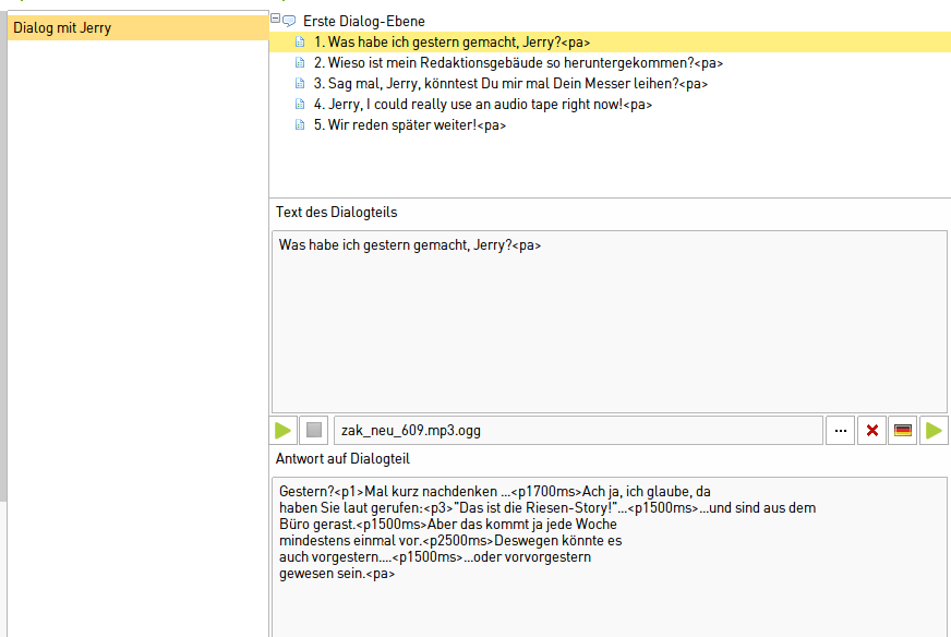
I can't make screenshots, because I use the 64-bit PC with Linux mostly. It's only remarkable on the dialog texts in the text areas for dialogs, I remember.


Dark and light skin should be enough.


