Where is my family, point & click game available

  • #10, by afrlmeMonday, 23. February 2015, 15:44 9 years ago
    what are you using to design the rooms?

    Imperator

    7278 Posts


  • #11, by wimfMonday, 23. February 2015, 15:47 9 years ago
    3dsmax evaluation version

    Forum Fan

    238 Posts

  • #12, by Marian77Tuesday, 24. February 2015, 15:33 9 years ago
    Looks good! I like the lighting.

    Forum Fan

    231 Posts

  • #13, by wimfTuesday, 24. February 2015, 16:44 9 years ago
    Hello, thank you.

    It's very motivating. smile

    Forum Fan

    238 Posts

  • #14, by wimfTuesday, 03. March 2015, 18:23 9 years ago
    Hi all,

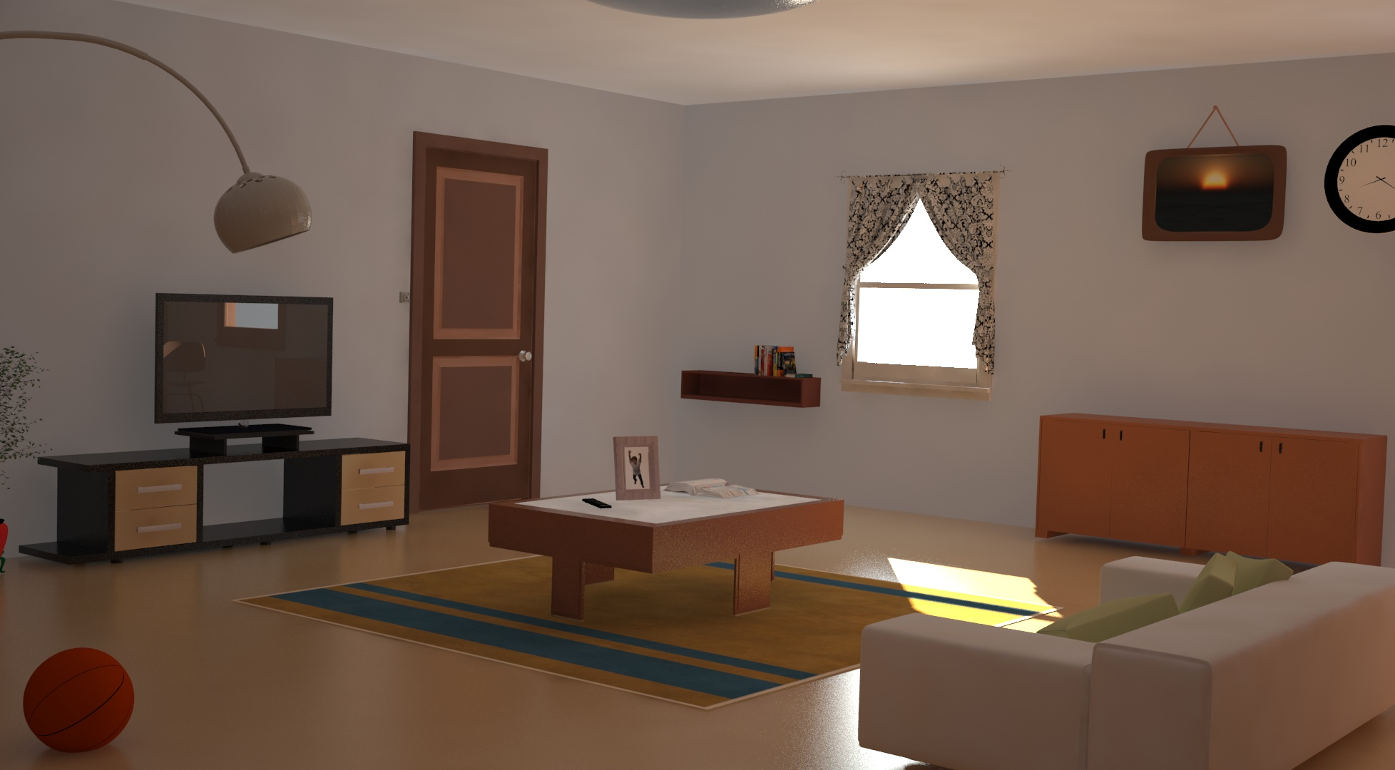
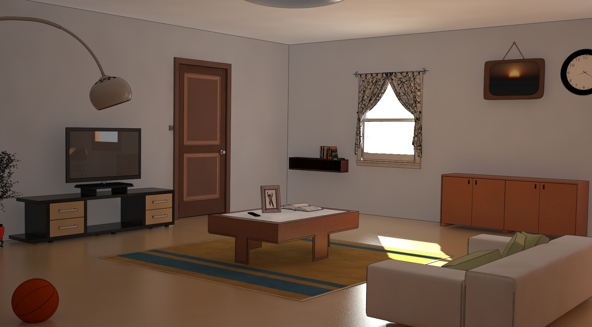
    After receiving many opinions on my sets, I followed the advice of the users and the advice of a decorator who explained the interior decoration.

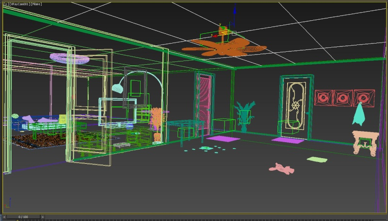
    I rework my scene to something more consistent.

    I hesitate between Frame 1 and 2, but I prefer the personal 2

    I hope that I will now be able to advance in the preparation of the demo

    Again, I am interested in your opinions.

    Thank you all.

    find my project

    http://wimfgame.com

    Forum Fan

    238 Posts

  • #15, by ke4Tuesday, 03. March 2015, 18:35 9 years ago
    The first picture looks much cleaner, maybe you could try use lines but always with a bit darker color than the current object. Otherwise looks pretty good. smile

    Btw i personally like to use textures almost on everything, you could use some wood textures if you like.

    Key Killer

    810 Posts

  • #16, by afrlmeTuesday, 03. March 2015, 18:35 9 years ago
    They both seem to be ok. My only issue with the toon version is that it's lined certain parts that would be better off unlined. For instance the walls looks better without lines. Also the lines between the bottom of the door & the table seem to rest into each other which is a little confusing - if you shifted it so the table was a little bit above the bottom of the door then it would probably make that look a lot nicer.

    The lineart also seems to be adding unnecessary lines to the plant & lampshade, as it's trying to outline tiny details which is actually reducing the quality of the detail in a way.

    Maybe you could find a nice contrast between the two version?

    Imperator

    7278 Posts

  • #17, by wimfMonday, 09. March 2015, 22:32 9 years ago
    Well, I just finished the integration of my character in my scene

    I let you discover the images and video (the image jumps come from the screen capture software) on my website and my blog


    http://wimfgame.com


    Next step, the interaction character objects

    Forum Fan

    238 Posts

  • #18, by Marian77Tuesday, 10. March 2015, 15:06 9 years ago
    Both look good, although I prefer the look without the lines, since the scene is rather realistic modeling, shading, lighting and rendering. Just adding lines won't make it look toon-like. Just a detail: The TV seems to reflect objects that are not visible in the scene. Maybe they are on the far side of the room? I'd suggest to move these objects that at least a small part of them is visible in the primary image, this would give the scene a bit more integrity.

    Forum Fan

    231 Posts

  • #19, by wimfSunday, 10. May 2015, 20:48 9 years ago
    Hello all,

    I am pleased to announce that the demo of my game "Where is my Family" is now available and downloadable.

    The translation "French to English" is not corrected in this version. This will be done in the next version. So sorry for the errors of translation.

    The cinematic intro was removed because it is not yet translated.

    Have fun with the demo version and feel free to give your opinion, to help improve the game and to continue the development to a full version.


    Forum Fan

    238 Posts

  • #20, by wimfThursday, 21. May 2015, 19:39 9 years ago
    WIP of the new room smile

    Forum Fan

    238 Posts