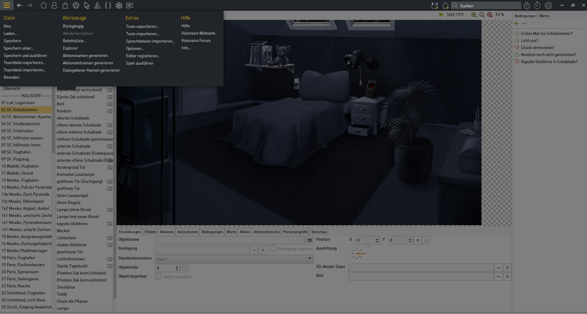
@ Thomas: the mobile menu icon makes sense to me as does the neat dropdown.
Don't forgot you also have a horizontal bar across the bottom of the editor that could be used for something (displaying data, some text/number input boxes, toolbar things) depending on what section is currently displayed & what is currently active in the editor as it's currently doing bugger all.
Anyway, yes. I like the menu design in the attachments you posted.

P.S: there's some other things I'd like to see change design wise if possible.
1. item section. I like the split form in same tab for adding both image & animation. I really think you should scrap image & allow the creation of an active & inactive item image. If people want a static image then they can just create a single frame animation. It makes a lot more sense to me rather than the static image as it would allow (with some changes to engine code) to have it auto show active animation on mouse over / held & inactive on mouse leave.
2. mouse cursor section. I think this should have the split form layout like the item section rather than the tabs. It would be much neater & better from a workflow perspective. Not much need for the tabs & it must be possible because you've done it for the item section.
3. I would really like to see some form of parameter inputs for setting the default rotation value of scene objects, their position, offset, transparency, etc & also position parameters for selected animations. I think best place for this would be unused status bar at the bottom or as a form on the right hand side where the conditions/values tabs are.
Probably a few other things, but I can't think of them off the top of my head. Other than that it's all looking really nice, though the action area tabs on main scene tabs are kind of confusing. They need hiding with conditions or something when they aren't needed to be shown.