Choosing a Graphical Style

  • #1, by redsparkMonday, 25. November 2013, 19:31 11 years ago
    I'm trying to decide on the graphical style of my adventure game. The player character is a detective who has a dark personal backstory that gets revealed through flash backs and dialogue as he solves new cases. I was thinking of a modern to near future setting in a ficticious city. The setting is not quite noir style but due to the nature of the mysteries that the player must solve, some will be a bit dark and gritty.

    Since I'm a programmer with only amateur art skills, what style best suits this type of theme? I'm afraid that if I choose the wrong style, it will detract from the atmosphere I'm trying to set. Obviously, cartoon is out. Would B/W graphic novel look ok? Or some desaturated or painted style? Or should I go with full colour realism? Also, I was thinking about using an Iso perspective rather than the normal point and click view. What do you think?

    Thanks.

    Forum Fan

    122 Posts


  • #2, by afrlmeMonday, 25. November 2013, 20:05 11 years ago
    I intend on using a very desaturated (almost black & white) tone for my own game I am planning which is a noir of sorts.

    I think desaturated tones or black & white work well for noir as does a big emphasis on the use of shadows & lighting which sadly is not something we can achieve in Visionaire Studio roll

    As for the art style: I'm not really sure as realistic (ish) characters & art would work really well, but then again... cartoon (well not really cartoon) art & characters could also work; if carefully done.

    Of course there is always the option of using 3D - bleh!- but each to their own, I say!

    P.S: I have no opinion on the view. you will just have to figure out which works/looks the best.

    Imperator

    7285 Posts

  • #3, by KinecMonday, 25. November 2013, 20:31 11 years ago
    I guess anything could be okay, even a slightly cartoony style, as long as it's not too "friendly" (means rainbow-like, icky etc., unless you'd like to create something weird) - it really depends on your taste and what you want to achieve. I personally like painted and drawn stuff and dislike 3d and photomanips (at least when it comes to point and click).

    I guess drawings in a rough style with dark or even black lines, darkish backgrounds with some highlights and maybe b/w or monochromatic color (and maybe some additional contrast colors?) could be nice. At least this sounds interesting to me if you wanna go for a darker atmosphere.

    I'd also like a semirealistic, painterly approach with not too saturated colors (this would be my preferred choice, but I don't know much about your story, so...).

    I normally don't like iso perspective that much, but that's really just my personal taste.

    Newbie

    15 Posts

  • #4, by redsparkMonday, 25. November 2013, 20:42 11 years ago
    @AFRLme: Thanks. I'm leaning towards a desaturated look too. But something with a couple of tones to it. May be something along the lines of an old pulp comic look.

    @Kinec: Thanks. I like that idea. I might be able to do that -- a semi saturated look. In all honesty, I don't like the 3D look much either in adventure games. But I have to confess that I'm not very good at hand drawn 2D. I'm mostly a 3D artist but I might be able to use some tricks to make it look more like a comic or painted feel and less like a 3D scene. I'll try out some examples and post them to see if anyone likes them. Otherwise, I might have to dust off my watcom tablet and learn to use it again. smile

    Forum Fan

    122 Posts

  • #5, by NovelMonday, 25. November 2013, 22:52 11 years ago
    Browse your movie/comic/whatever collection and find media that are similar to what you want to do. Watch them without popcorn but with a notebook and write down what you like and describe the scenes and their atmosphere as well as the camera perspectives. After a while you will know what you want your game to look like.

    Why decide between typical front 2D and iso? There is no barrier for mixing perspectives and as a player I love some variation here, 2D, isometric, very far, close up etc everything is possible. It only means more work, of course, eg. changing the outfit to a different perspective when you change scenes. But when your adventure is designed in 3D that should not be such a pain.

    I guess the most important part, however, is to have a full plan of what you want to achieve before you start with the actual game, like a storyboard. Before that, I'd recommend to make only some demos for yourself to find out what can be done easily. Otherwise you'll get stuck and fiddle around for ten years. Like me.

    Newbie

    100 Posts

  • #6, by redsparkTuesday, 26. November 2013, 14:21 11 years ago
    Thanks, Novel. I agree. I started watching some 1950+ noir detective movies for how they set the atmosphere through camera angle and lighting. It made me go back and change the lighting of my first scene to add more dramatic shadows and change the camera a little. They weren't dramatic enough. wink

    I had thought of switching between views like go to Iso when the detective enters investigation or combat mode or something like that. I'm not sure I want to go through the extra pain. But I will consider it.

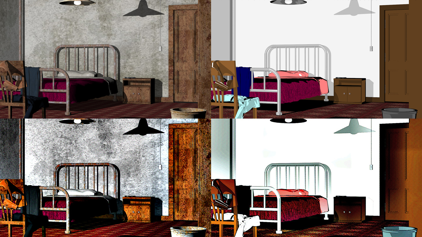
    I found a pretty nice render setting on my app that gives a duotone image. However, I prefer the comic book render image. It gives a gritty old school feel. I think the trick is to get the lighting right. Here is a comparison of a basic 3D scene (Which has no post-work to make it look nice) and the toon render (which looks too cheery for my story). As well as the comic book post work in a noir style is on the bottom of each.
    http://www.dungeon-crawl.com/wp-content/uploads/2013/11/TestStyles.jpg

    I like the comic book style on the real render the best. It keeps a gritty feel. I just have to monkey with the lighting to make it not contrast so much that it is hard to look at. May be desaturate it a bit? What do you think? Would the comic book render (bottom left) be something that you can tolerate? smile

    Forum Fan

    122 Posts

  • #7, by NovelTuesday, 26. November 2013, 17:27 11 years ago
    I can see you are already quite advanced with your graphics. I personally like the original top left pic best. That's probably because, as you indicate, the one bottom left got too much saturation. But the atmosphere is good, creepy, that is, if you wanted to a achieve that. Those to the right don't work (yet) because the surfaces lack detail.

    Newbie

    100 Posts

  • #8, by redsparkTuesday, 26. November 2013, 18:29 11 years ago
    Thanks, Novel. I think I'll work on the bottom left one a little bit and see if I can get it where I don't need a set of sunglasses to look at it. wink However, I really like that comic book feel. I'll have to attempt a character as well and see how he looks inside the environment. If they look convincing together, I'll go with that style.

    I'm mostly going to play with Visionaire to gain experience with it over the next little while. Hopefully, I will find a good style that others like.

    Thanks again.

    Forum Fan

    122 Posts

  • #9, by NovelTuesday, 26. November 2013, 22:41 11 years ago
    Sounds like a good plan. smile
    You could try some gentle artistic filters to make it look more comic like. 3D rendering looks always a bit too sterile if you ask me. Just make sure to write down which filter you added in which combination so all pics look the same way.

    Newbie

    100 Posts

  • #10, by redsparkSaturday, 21. December 2013, 02:31 11 years ago
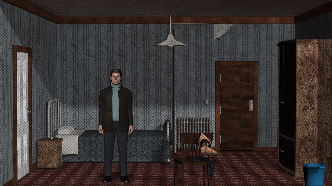
    After lots of playing around, I think I have finally gotten the combination I wanted. I changed the original test scene a lot to give an image that is something more in keeping with an adventure game. The shadows are not as pronounced as should be for Noir but I'm not going for a pure Noir look -- just something with a hint of it. Hopefully, it is more of an old print comic book feel and less like a 3D scene.

    http://www.dungeon-crawl.com/wp-content/uploads/2013/12/Hotel_Bedroom021.jpg

    I included the player character this time. I'm still not quite satisfied with him but I can't put my finger on it yet. I like the rest of it though.

    Forum Fan

    122 Posts

  • #11, by saintandsimonSaturday, 21. December 2013, 13:30 11 years ago
    Looks nice! Nice character-design smile

    Newbie

    85 Posts